concepts
Concept creation is the most important stage in interior design. It is the foundation for building an aesthetic, functional interior that responds to the real needs of the future resident. In our workshop, we devote a lot of attention to this stage of the project, because it is also the moment of shaping the right relations with the investor.
We start the project process by getting to know the place of investment. Each interior, both redesigned and designed from scratch, has its own individual character and mood, which is the starting point for the concept. Our task is to create a good space, from the general to the smallest detail, so as to get the best out of it. We often achieve this by designing furniture in a convention corresponding to the character of the interior. Our team loves playing with color, light, material and form, so when creating kitchen, bathroom or bedroom furniture designs, we are looking for non-standard and innovative solutions. We want every project to be a result of a combination of our passions, customer dreams and functional solutions, because only then our creativity gains true value.
korzeniowskiego
bracka 2
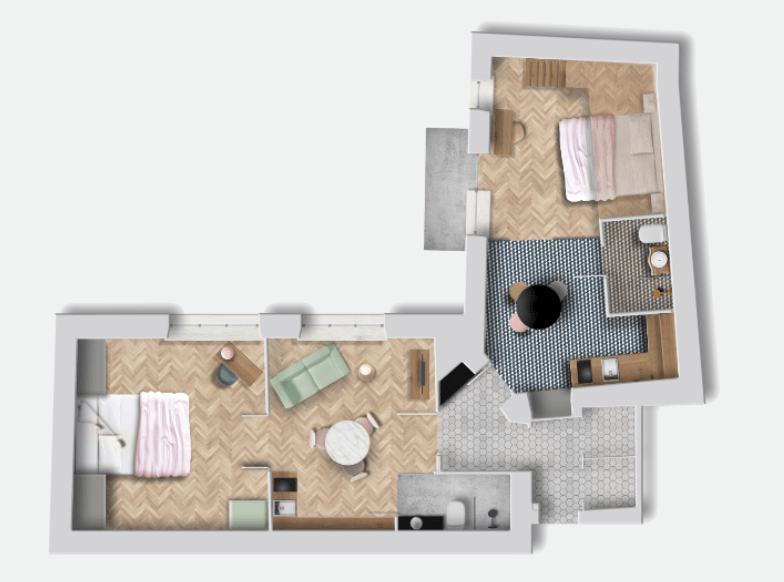
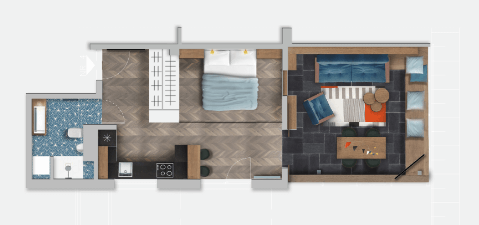
Conceptual design of apartments for rent on Bracka street in Krakow.
The main design assumption was to create two separate apartaments within one space in an old tenement house located near the Main Market Square in Krakow. We wanted to create a characteristic space, which is an interesting object in itself, a place telling a story.
We set ourselves on bold color combinations, dividing the space into the first apartment dominated with the lush greenery and the second one with the predominant grenade. The eclectic whole was to be merged by roses and gold accessories. As a result, we got spaces that were based on simple graphical color schemes.
The bedroom in the green apartment was supposed to give the impression of a real jungle, which is why we chose a wallpaper with vine leaves and juicy watermelons. Wallpaper covering the entire wall, hides the built-in wardrobe.
The navy apartment is a much more complex space, divided into a dining room with an annex and a bedroom with a mezzanine. Openwork wall with glazing, which separates both zones, is an essential element of color and decoration. The kitchen has the Esher-like graphic floor and the entire bedroom is dominated by a dark blue wall with a graphic element – a painted outline of Great Britain and a powder painted, technical construction of stairs to the mezzanine. The whole has been enriched with paintings which coloring directly refers to the atmosphere of both interiors.
grzegórzecka
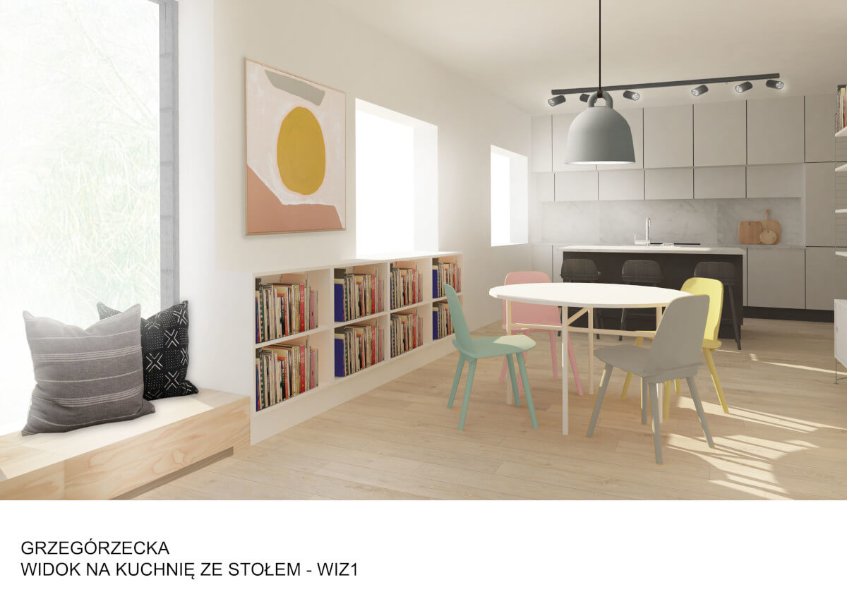
Conceptual design of a studio in Krakow.
The apartment on Grzegórzecka Street was designed for young, active, energetic people. In response to the needs of the owners, we focused primarily on making the small space as functional as possible. Due to the young age of investors, we allowed ourselves a bit of madness, the apartment was completely rearranged, and most of the partition walls were demolished. Thanks to this operation, it was possible to create smooth transitions between particular rooms – the corridor transforms into the kitchen, dining and living areas and smoothly transforms into a bedroom.
The main color inspiration for the interior was the combination of delicate pastel colors, including delicate pink, yellow, green, contrasted with black, white and rusty brown. The same color motif appears on the fronts of the cabinets, which form entirely multi-colored walls. The colorful compositions have been combined with simple monochrome kitchen furniture finished with marble, which is an extension of the cabinet’s monolith. In space there is also a place for a simple solid of a kitchen island with hokers around. In the zone next to the entrance there is a secluded place for two workstations and shelves for storing the necessary documents. Colorful chairs at a wooden folding table, which is the central point of the apartment, refer to the color of the multi-colored fronts of the wardrobes. The main place to relax is a soft sofa, comfortable armchairs and a bench with pillows located under the window. In the recess of the flat, a place for a bedroom was created. It is a platform separated from the rest by an openwork steel wall, which, if necessary, can be covered with an opaque curtain. On the platform there is also a wardrobe and a place to store books, just above the bed.
The whole space is a perfect interior for young people, which through its open layout inspires and gives a sense of freedom.
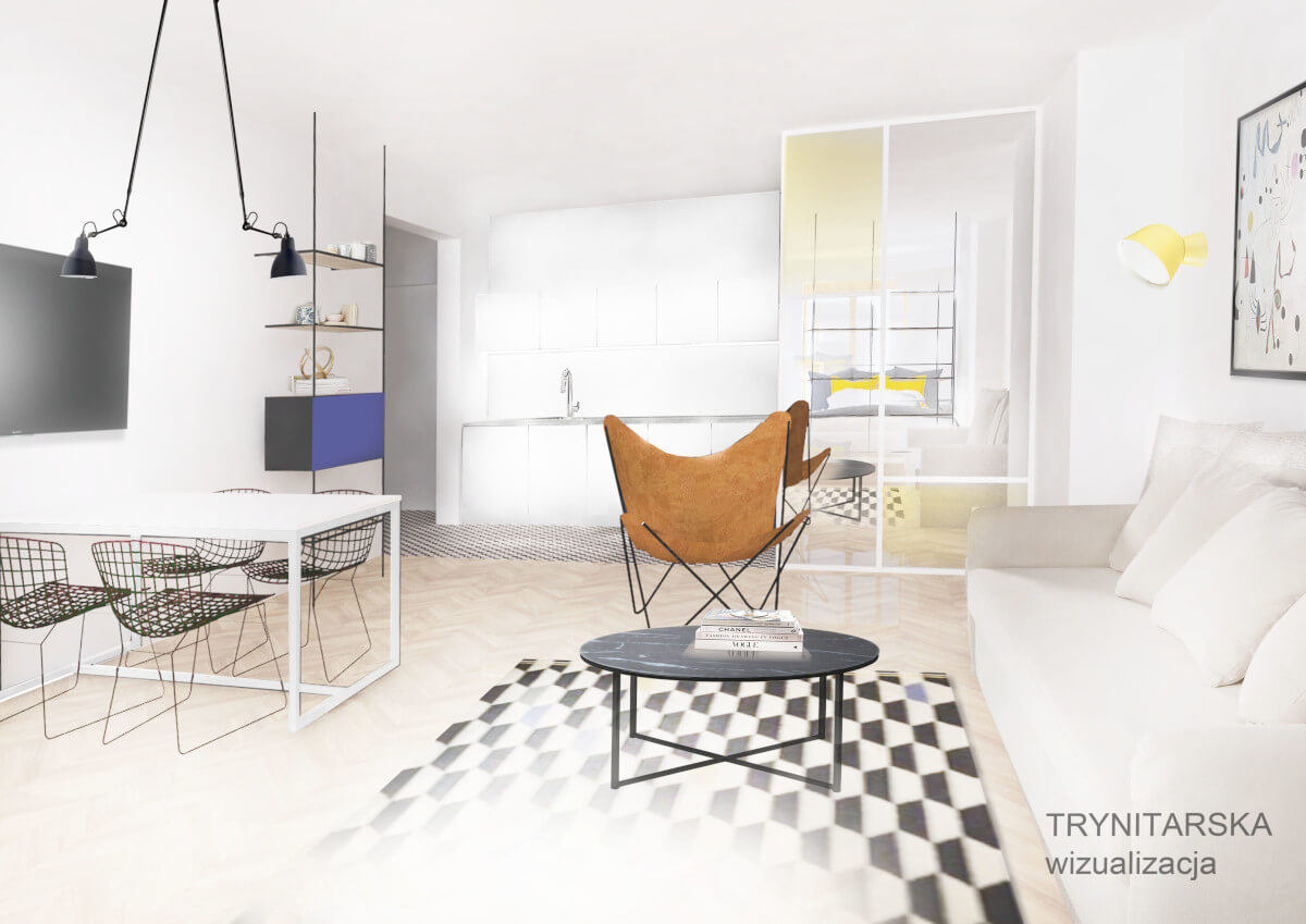
trynitarska
królewska
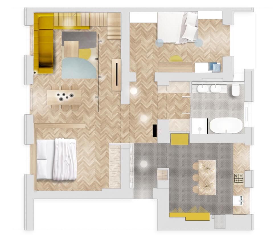
A conceptual design of a two-room apartment at Królewska street, located in a tenement house from the first half of the 20th century.
The apartment on Królewska street, at the very beginning, amazed us with its climate, light, proportions and wooden elements of finishing. The existing interior was a great starting point for our further work. However, it did lack freshness, life and functionality, lost over many years.
The inspiration for the design were the color accents found on the dilapidated walls, under the last layer of painting – mustard yellow and pink – the most fashionable colors of the 1960s. Our main assumption was to leave as much as possible the climate of this place, which is why the renovation was to be mainly oak and woodwork.
In the rearranged kitchen, there was a place for the kitchen island with hokers, a long string of kitchen under the windows and a high cupboard for glass and porcelain. The whole has been kept in mustard color with wooden elements. The white walls were to be balanced by a dark, anthracite floor consisting of herringbone tiles. The space was complemented by reproductions of Picasso graphics, which became the leitmotif in the whole apartment.
The investor wanted to arrange the apartment in a functional way, so that it could accommodate all utility devices and large wardrobes. We decided to camouflage the storage compartments and wardrobes using simple painted fronts imitating the wall. To optically enlarge the existing space, we placed large mirrors on the door to the newly created bathroom.
The bedroom is dominated by mint, blue and gray colors. In the middle of the room there is a specially designed bed, containing handy shelves and lockers. The wardrobe is covered with mirrors that reflect light from the window opposite. Thanks to this, the bedroom is always full of light during the day. On the wall you can see Picasso’s elaborate graphics, made in the technique of murals.
stoisko II
stoisko III
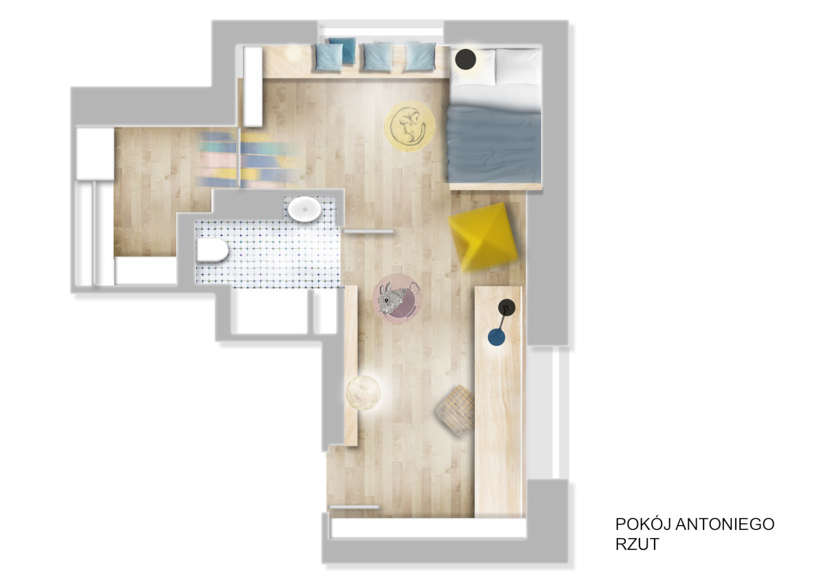
pokój antka
